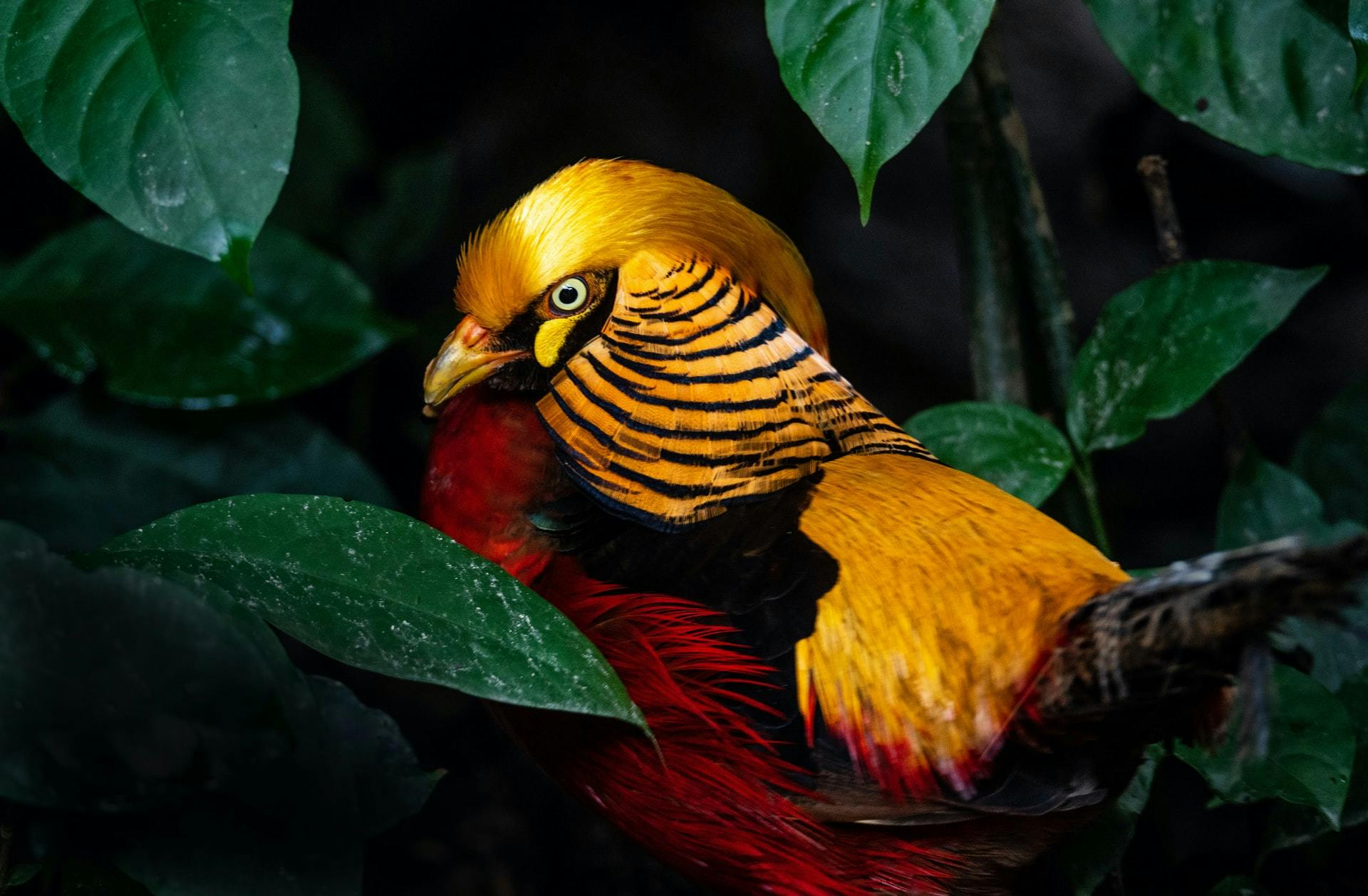
A colorful bird

by Astha Mishra

Color Psychology In Web Design For Interior Designers.

Explore the many shades of colours in this post where we explore how different are the impacts color psychology have in interior design and website design!

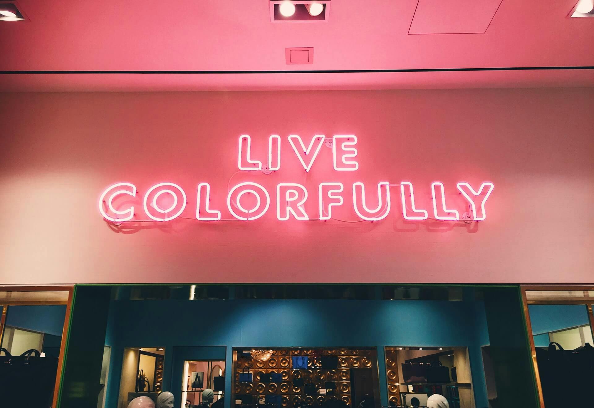
Live colorful

Colours, due to their impact on our perception, emotions and decisions, have long been used by marketers to create the desired impact on their prospects. Although you will always find those who will oppose this idea, there is plenty of data available to prove that colour does make a difference.

Humans have always used colours as the primary way of perceiving the world around them on a very primal and instinctive level. We have learned and evolved to associate different colours with different moods, situations and emotions.

Interior Designers don’t need a lesson about colours and their impact on the human psyche, mood, and emotions - colour psychology has always been a powerful tool in the world of interior designing.

But here’s the problem: many interior designers use the same colour psychology on their websites as they do in their work. And that’s not right.

Yes, the colour choices for interior designing are not going to work on websites because websites appear on screens. Let’s see how things are different...
Colour psychology - websites v/s interiors

Screens hit our eyes differently. Colour combinations that might be pleasant to look at in a house won’t work the same way on a website.

Consider a yellow-green combination - this spring decorating colour scheme would be enchanting in a house, but this combination is deadly for a website, which will be viewed on a screen. Instead of creating a lively and cheerful mood, it will put a strain on the eyes of the viewer.

A website has to be designed independently of the colour schemes used in Interior Designing. We are not saying that colour psychology has suddenly changed for the screens - but colour psychology has to be used differently for websites.

And let’s not forget one important factor - intent and motivation. In interior design, your key focus is to please your client by providing them with a lush, aesthetically pleasing environment.

The purpose of a website is diverse though - it’s there to communicate your ideas and showcase your talent, and more often than not, it’s a crucial guide for your prospective clients.

You have to use colours to motivate them to keep cruising on your website and finally take action. Let’s see how different colours are used in web designs.

Colours and their impact

The world of colours and designs is magical indeed. Each colour that you use will leave a different sort of impact on us on a very deep and subconscious level.

Let’s have a look at the impact of some primary colours in the world of interior design and website design.

Blue

Blue

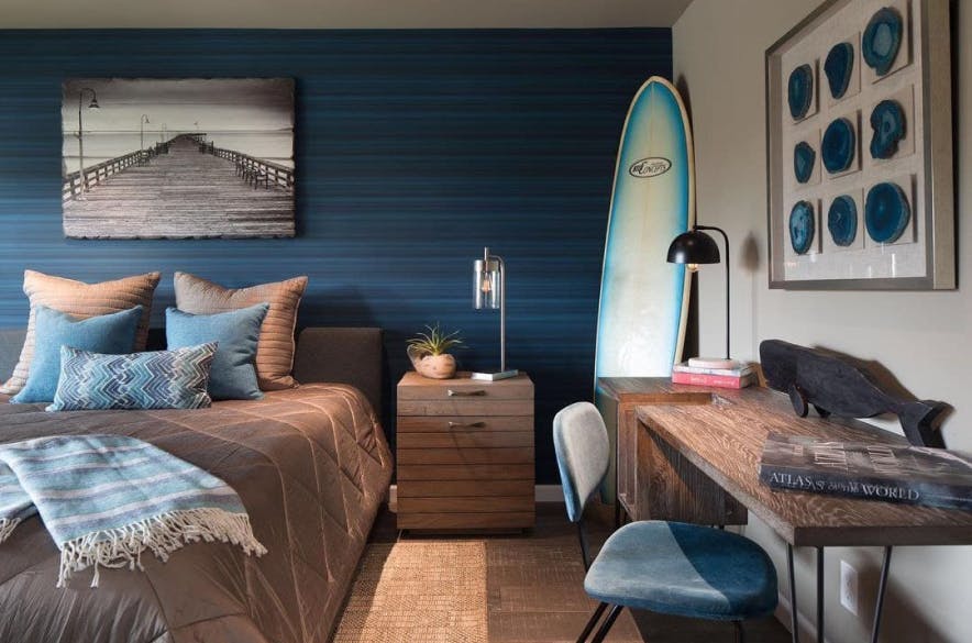
Blue colours are often meant to infuse a surrounding with feelings of calm, serenity and peacefulness. Interior Designers often use blue in bedrooms and bathrooms to help create a tranquil atmosphere ideal for relaxation.

Blue

From the pristine white sofa to the prism coffee table, a kind of chill and clean style is palpable in Patrick Bateman’s apartment. Even the paintings that have been used are completely in harmony with everything else.

Yellow

Yellow

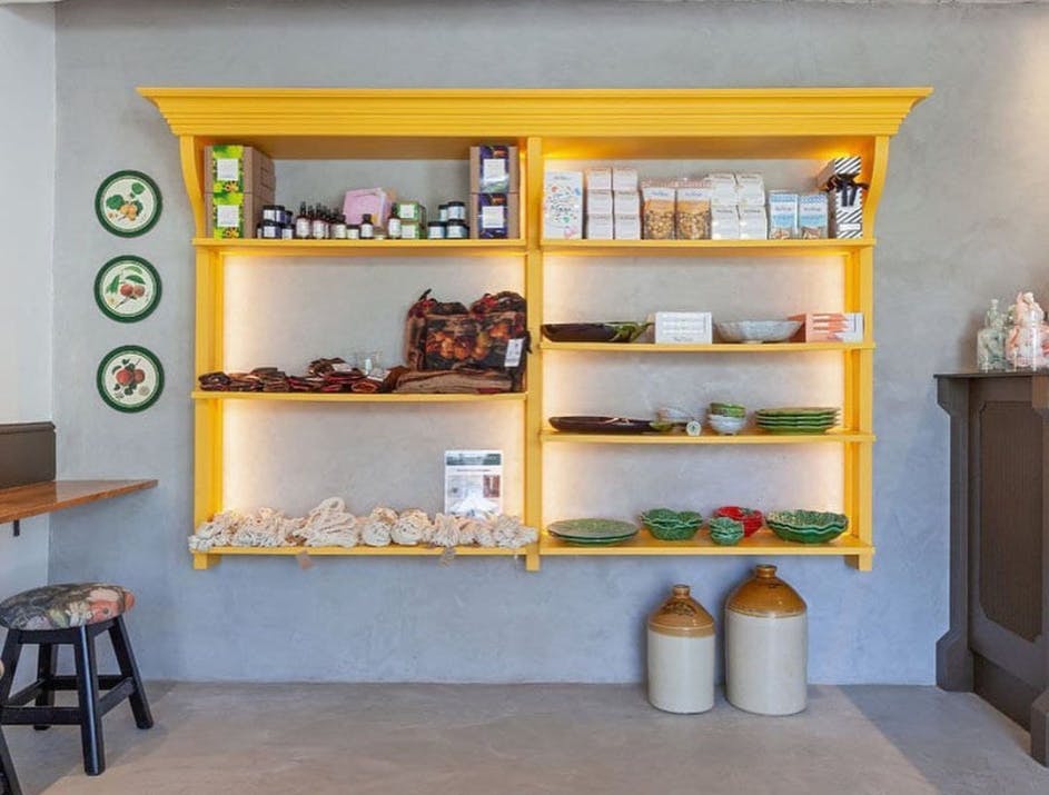
In interior designing, yellow is a colour often used to incite creativity, energy and happiness. It’s a reminder of sunshine, fun and vacations, often used in children’s room since it sparks creativity and encourages good communication skills.

Yellow

The pure yellow colour on a website is an indicator of a warning, a reminder that here comes something you should beware of. Since it’s so bright, it’s better used in moderation because screens are already stressful enough on the eyes.

Yellow is not the right choice for your website if you want to present yourself as a high-end, luxurious service provider.

White

White

White colour when used in interiors represent evoke a sense of simplicity, purity and cleanliness, giving a sense of fresh and modern interiors. Lately, the trend of white interiors with minimal furniture has become trendy, thanks to the rising popularity of the Scandinavian design.

White

White is in web design brings with it a feeling of freedom and minimalism. Nothing gives you the feeling of negative space in the world of web design as the colour white. Yet, just because you’re using white doesn’t mean your work is done.

With so many websites using the minimalistic approach, it can easily get dull and boring to use plain white space - better spice it up with subtle hints of other colour shades.

Green

Green

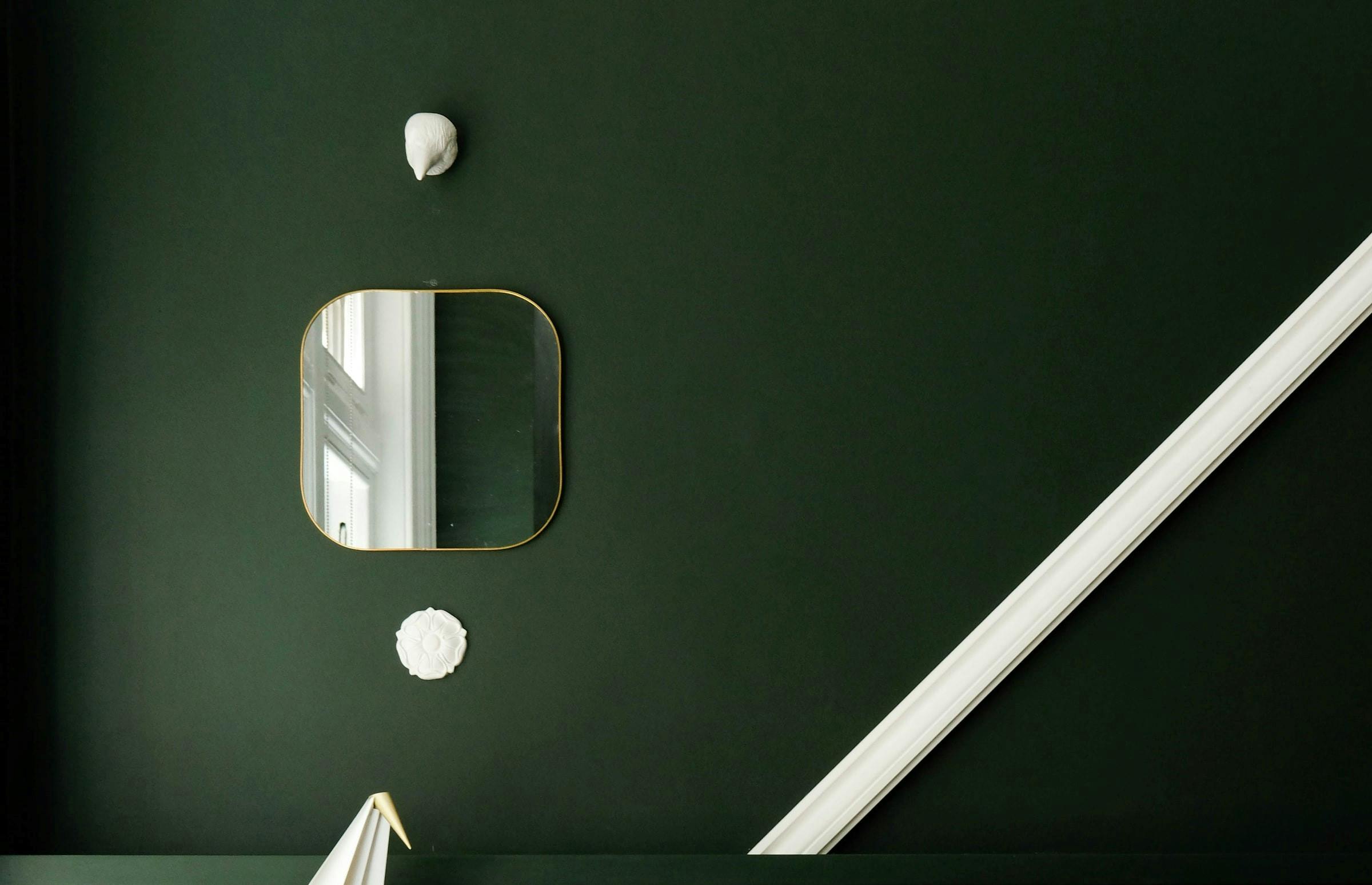
Green is an elegant colour and mostly used in interior designs to create a sense of harmony and balance in the home. Since it’s such a close reminder of nature, people in cities often use this colour to feel refreshed, tranquil and connected to nature.

Green

When you are using this colour on websites, it’s a strong indicator of an environmental cause. Mostly those websites whose ideas, philosophy, products or services are connected with environmental causes use the colour green.

You will see organic product brands, ‘natural’ supplies, nurseries or environmental campaigns using green as a primary colour in their websites. Websites providing services in technology or luxury goods should avoid green on their websites.

Brown

Brown

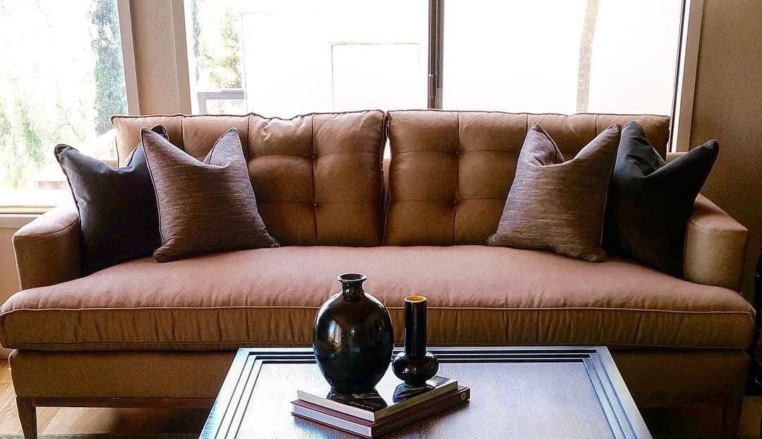
Brown colours are used in interior designs mostly to bring a sense of comfort and cosy warmth to a place. Often associated with natural substances such as wood, leather, soil or dried leaves, the use of brown brings in a feeling of natural insulation in a place.

Brown

On websites, though, brown colour is more associated with appetite than anything else - recall those chocolate and coffee company websites? It’s because nothing gives a feeling of textures on screen better than brown does.

Orange

Orange

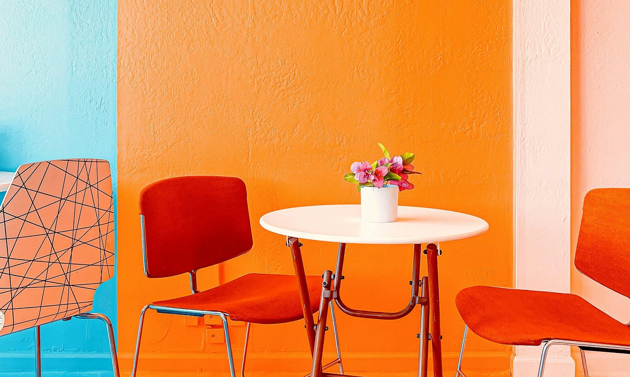
Just like yellow, orange colours are bright and energetic, no wonder, given the fact that it comes from a combination of red and yellow. Orange is used in interior designing in a moderate amount to bring in an energetic feel to the room, often a reminder of autumn.

Orange

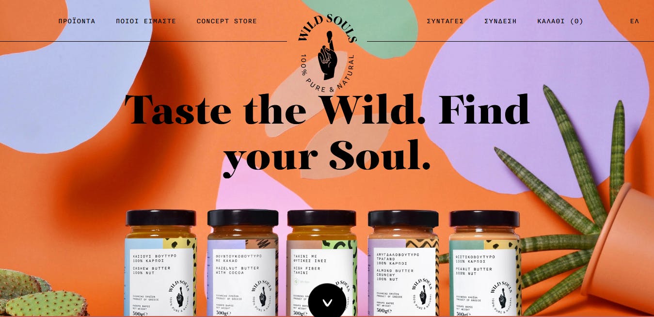
Orange is a perfect colour for web design when you have to attract attention enthusiastically, but without getting too loud or bold. Unlike red, which can be too bold sometimes, orange is a simple friendly colour - unless it’s overdone, like anything else.

Orange is best used in pops or bursts of colour, in the foreground on websites - it’s not so much a great choice as a background colour. So unless you’re selling energy drinks, we would recommend limiting orange to the foreground when making an announcement or to grab attention.

Pink

Pink

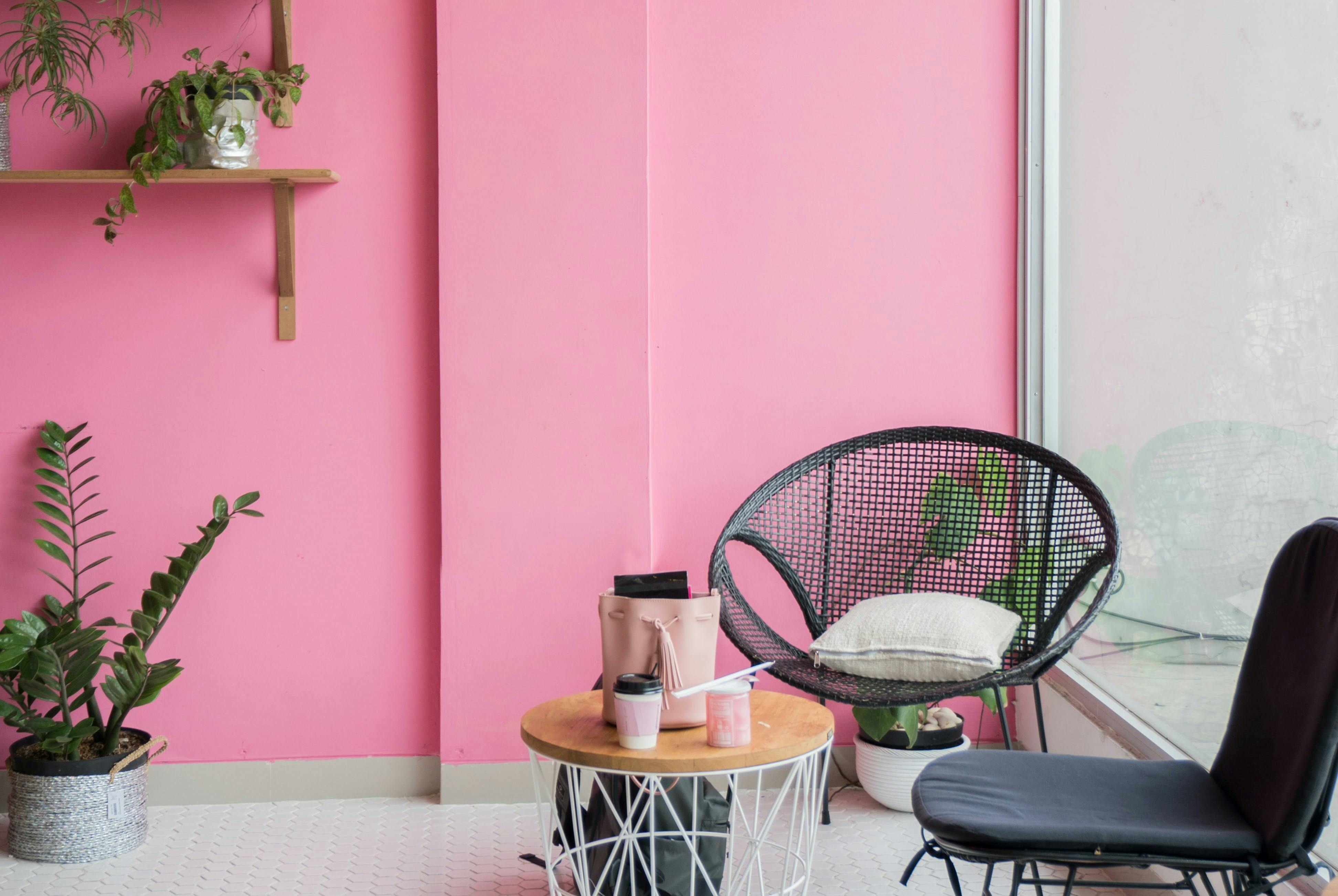
A highly underrated colour, pink can create a magical experience if used properly and without the famous bias of being a too girly colour. In interior design, pink creates a nurturing, soothing and gentle environment.

When used in different shades and hue, pink’s nurturing and romantic impact can provide certain emotional security and tenderness. And no, pink doesn’t have to be a girly colour saved exclusively for your daughter’s bedroom and clothes - use it well and you can see its transforming effects anywhere in your house.

Pink

In web design, pink has traditionally represented romance, love, sophistication and tenderness - it’s primarily used for feminine products with women and a young girl being the target audience.

Does it mean you can’t use it for your website if you aren’t targeting women? No, you can definitely use it for your website if the idea you want to communicate goes well with it. Pink is a gender-neutral colour that works well both in the foreground and the background, working its charm subtly.

Grey

Grey

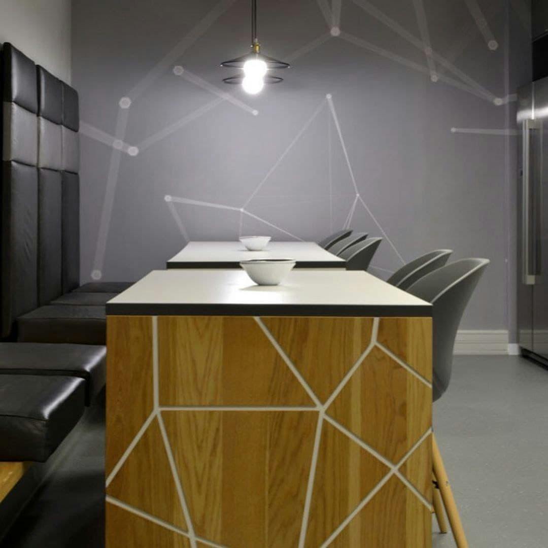
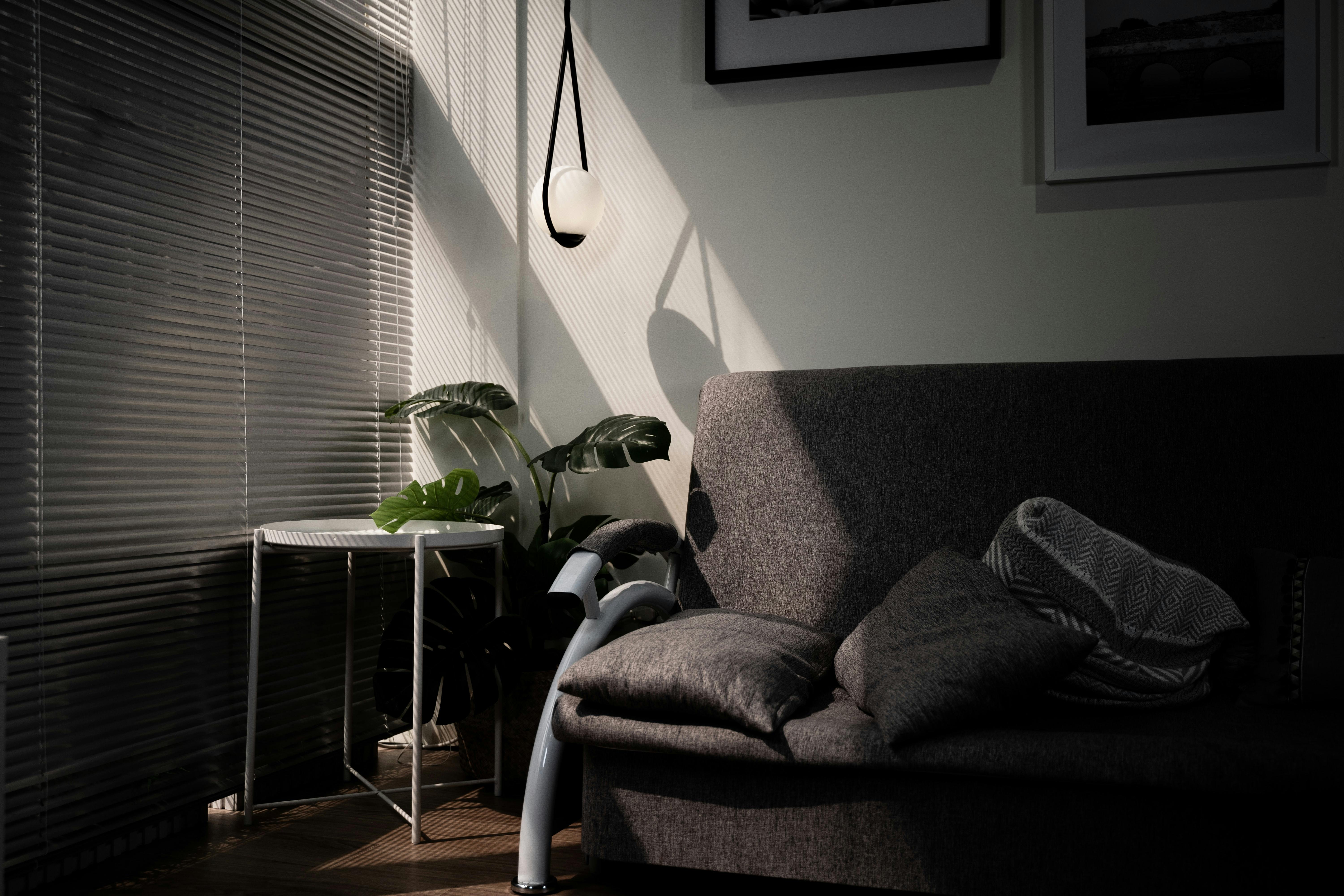
In the world of interior design, psychologically, grey colour influences a person’s sense of security and intelligence. Other than that, it also creates a sense of calm and composure which makes it a perfect colour choice for houses where little excitable children live.

Grey

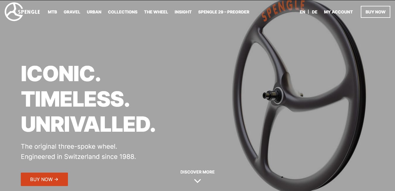
In the web design, the first impression one gets from a grey website is that of luxury, evoking a sense of formality, sophistication, professionalism, timelessness, practicality and strong character.

The best way to use grey on a website is to use it for selling luxury goods or making professional websites. It’s best to avoid using grey for attracting attention - it’s too cold and dull for that purpose.

Purple

Purple

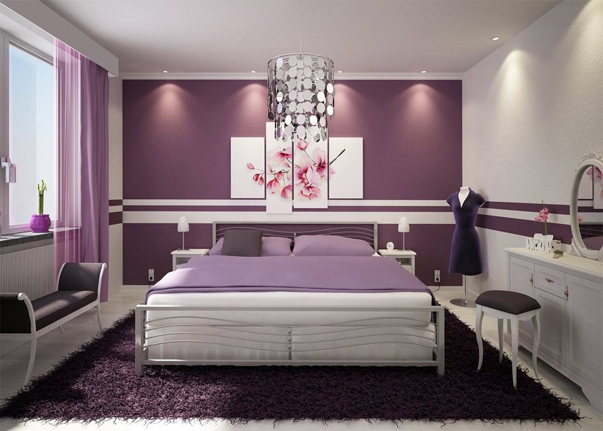
Known as the colour of royalty, the psychological influence of purple delves deep into our psyche to create a sense of fantastical mystery, creativity and imagination.

Purple

Purple, depending on the shade and hue used, can be both feminine and masculine. It’s best used in - but not limited to - dressing rooms in houses.

In web design, purple is best used in the niches like astrology, beauty products, yoga, healing, massage, and spirituality. It’s not a good choice for grabbing people’s attention but makes for perfectly soothing and tranquil background colour.

Red

Red

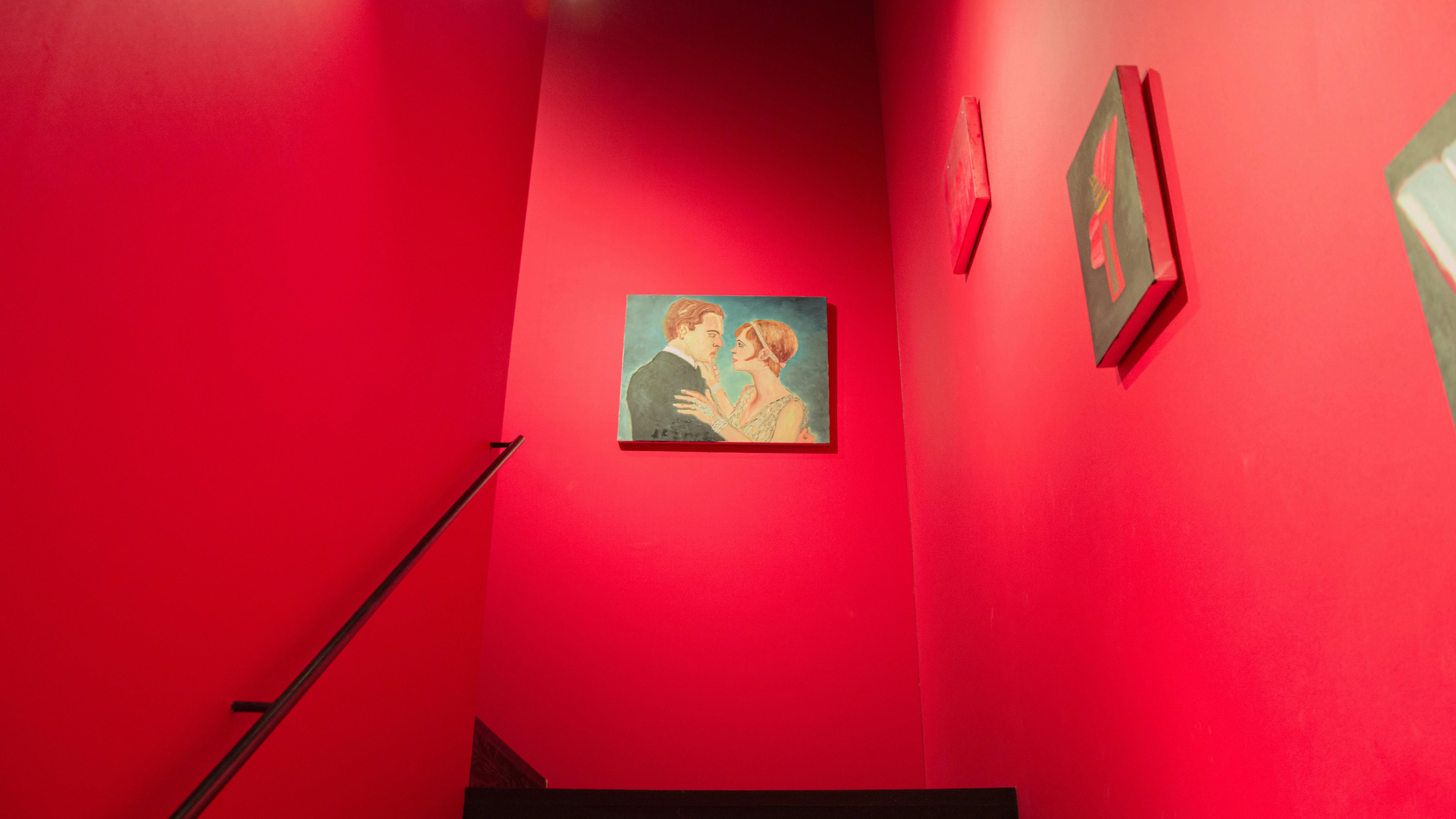
Ah, red - the colour of passion, excitement, intensity, power and ambition. One of the most dramatic and enticing colours to play around with, red makes for a perfect part of the house where high energy is constantly needed - entertainment spaces or where the family gathers often to have fun.

Depending on the shades used, red can be overwhelming or soothing and inspiring. The lighter shades of red can be used to inspire creativity and the darker shades can be used to demonstrate power, drama and confidence.

Red

In web design, red shades are perfect for attracting attention to something and creating excitement around it. While red is an ideal colour choice for food, fashion, marketing, entertainment, sports and emergency services, it’s not at all great for luxury or professional websites.

Black

Black

Black is the colour of className and sophistication and one of the favourites of many interior designers. Black creates an aura of mystery, power, sophistication and elegance. In interior designs, black is more often than not used as an accent.

Black furniture, matte black accents to interiors and even as curtain and bedding, black can be used in many ways - but never as the main colour of the house. An all-black interior can get dreary and depressing all too soon.

Black

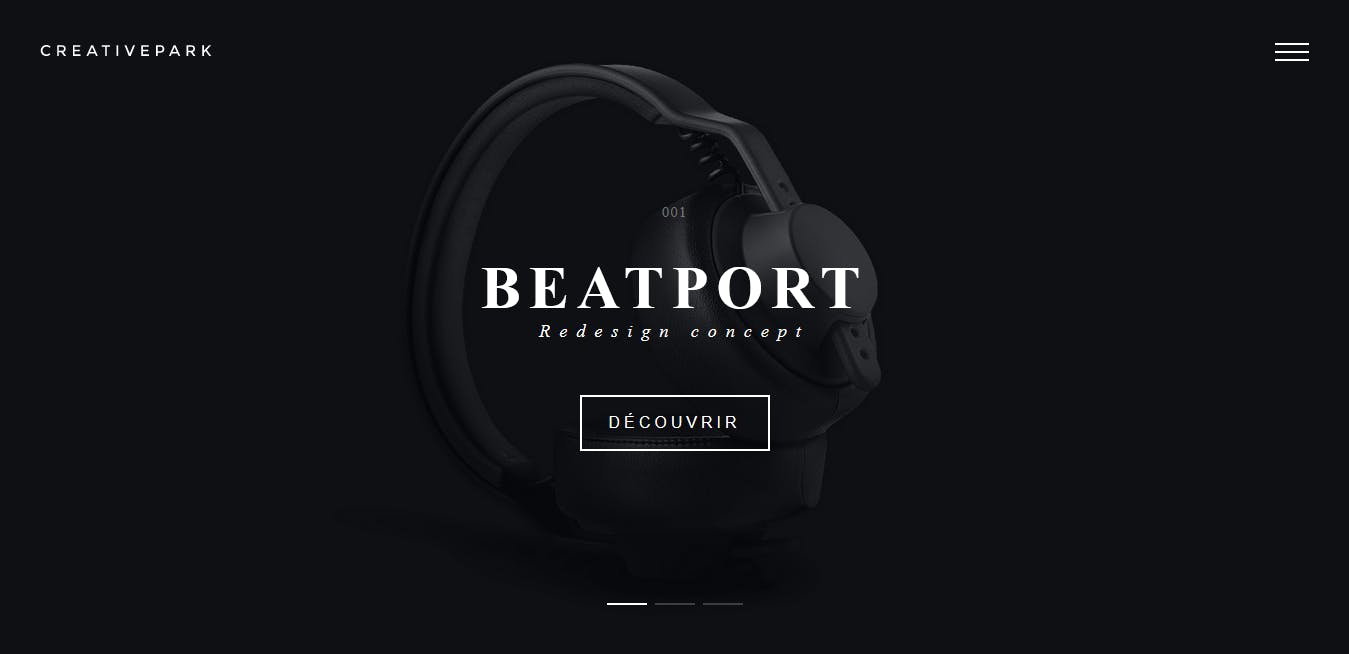
In web design, colour as strong as black is used to exhibit elegance, stability and strength. Black is best used for luxury goods and services, marketing, fashion and cosmetics.

Beyond The Colours

We have discussed all the major colours and how they create an impact and trigger different emotional responses from us. Aren’t colours absolutely wonderful?

And while what we have mentioned so far is all true, it’s still half a knowledge when all other elements of a website like fonts, shapes and pictures are taken into the context.

A website has to be designed independently of the colour schemes used in Interior Designing. We are not saying that colour psychology has suddenly changed for the screens - but colour psychology has to be used differently for websites.

The impact of colours is what we told you, but it’s in no way limiting - if you know how to mix and match different colours with other elements of a website, their effect can yield rewarding results.

Don’t think that these colours are limited because of their particular aura and influence - instead, these colours when complimented with each other correctly, can work wonderfully in overcoming these limitations to achieve amazing results.

Just keep learning about these magic elements!

Special Thanks

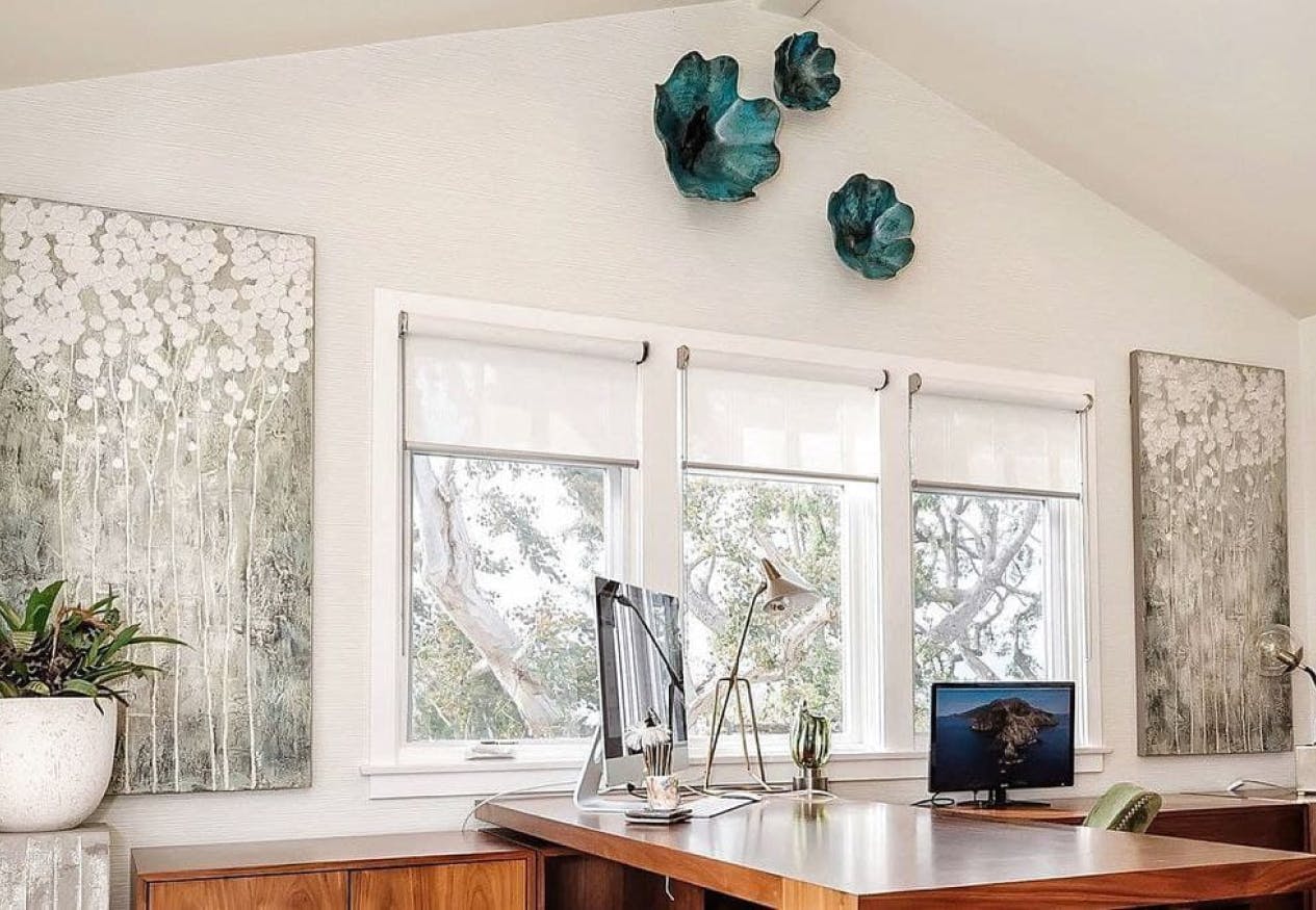
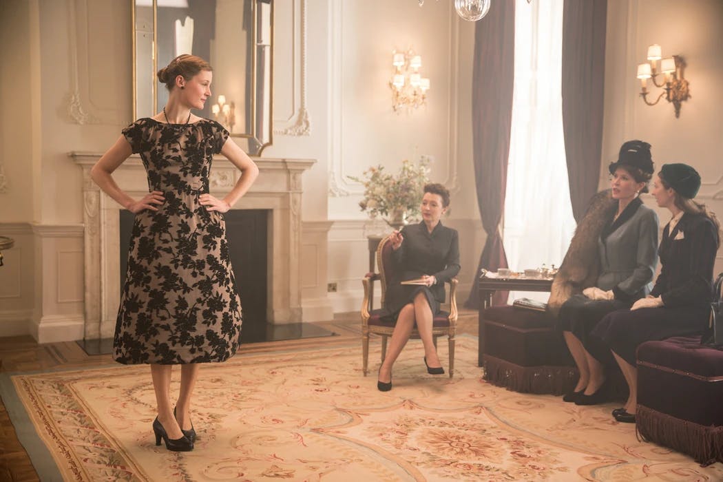
And now, we would like to thank Kamaren Henson and Renée de Waal, whose works we featured in our post!

Their masterful grip on their craft and colour psychology can be seen in these pictures.

Next Article

Best Apps For Beginner Interior Designers To Nail Their Game

Here is a list of the top 5 best-rated apps for interior designers which will help you give your best.

journal arrow
Phone on the grass