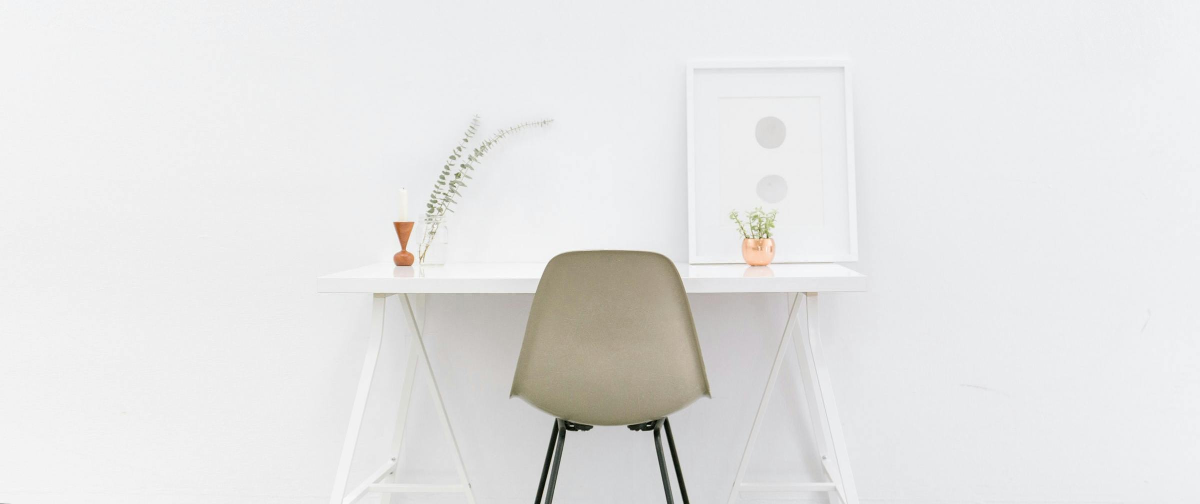
Minimal Chair

by Astha Mishra

Are You Thinking About Getting A Minimalist Website?

"Perfection is achieved, not when there is nothing more to add, but when there is nothing more to take away." - Antoine de Saint-Exupery

Minimal Chair

Minimalism and its philosophy of "less is more" has taken over the world today. Just like a minimalist lifestyle isn't all about merely reducing extra things from your home, a minimalist website isn't all about cutting out extra design elements.

Whenever talking about minimalism, many people confuse it as being a simple style when it's actually anything but simple. Doing more with less is way harder than anything else - even in web design.

In the world of web design, minimalism means cutting out everything extra - not only visual elements. It's done to ensure an overall smooth functioning of a website to yield the website's desired results and proper functioning.

Adding things just because they seem to provide an overall great experience can be counterproductive if your system gets burdened by extras. A minimalist website will create an overall harmonious experience without any burden - the experience that is seamless, intuitive, smooth, cluster free and modern - not just empty spaces.
Why minimalism?

minimal vase

While minimalist websites can get repetitive if not tended correctly, there is a lot of space for creativity if the designers know how to do it. It's important to understand that it's not an "easy" or a "simple" design - it's full of clean, clutter-free and creative beauty and experience that can be pretty tricky to achieve.

Do you know another thing that can sometimes be trickier than designing a minimalist website? Deciding if it's the right style for you or not! Today everyone wants to jump on the minimalist wagon, and many do it even if it isn't right for them. Before you go for a minimalist website, let's see why you should or shouldn't have it.

Minimalism uses a lot of negative space to bring focus to the content of the website and it's a core pillar of modern web styles. Here are some most important reasons why minimalist websites can be a good option:

  • It represents luxury and high value.
  • It's a great choice to draw focus to the content.
  • Makes for easier navigation.
  • Improves overall user experience with smooth functioning.
  • It's the epitome of modern design

All that being said, here's a word of caution for you: a minimalist website is not always the right option for everyone. What's more, it's important to know how minimal is enough minimal. Let's check out the biggest mistakes web designers make with minimalist websites and make sure your website avoids them.

When minimalism can backfire?

Gun

While a minimalist website is definitely awesome, there are times when they can be dull or straight out boring. This does not happen because minimalist websites are boring but because sometimes designers aren't equipped or practised enough to make them unique.

When you have to eliminate most of the extraneous elements, what you do use becomes a matter of high importance. Often times websites trying to be artistically minimalist start looking sinfully dull and boring.

Another big issue comes with communication. When your website designer doesn't know when to stop, he/she might end up cutting off a very important piece of information. With limited options, many designers have committed the sin of stripping off their websites of their very core and purpose, to the point where the prime idea never gets communicated to the viewers.

Common myths about a minimalist website

Magnifying glass

It's not that uncommon to see new trends and ideas springing up about a trend that has effectively taken over the world. Unfortunately, many of these ideas turn out to be big misconceptions. Let's address some of these misconceptions that come with minimalist website design, shall we?

White Space: Whenever talking about minimalism, many people confuse it as being a simple style when it's actually anything but simple. Doing more with less is way harder than anything else - even in web design.

It's Simple: Not. At. All. The biggest misconception about minimalist websites is that people think anyone can pull it off - you just take away the excess, right? Ummm... not really. When you have limited options and space, you have to be very creative to make sure that the website does retain designs and not end up becoming an ancient shallow page devoid of any distinct personality at all.

Can Get Boring: This is one big misconception to believe minimalist websites are boring just because they are neat and clutter-free. Minimalist websites can actually turn out to be quite fun and quirky if the right elements are used in a controlled way.

What remains, matters

white door

When you have taken off all other stuff, what does remain becomes extremely important. Smart choices are needed to make a minimalist website really work and serve its purpose. With minimalist websites, whether you go right or wrong, it can turn around the complete website on its axis - your dream website might end up yielding nightmarish results.

We have seen many wonderfully beautiful minimalist websites and no doubt, they create such aspiration in the hearts of others to have something similar. But similar can sometimes get too similar in minimalist websites and you might wanna steer clear of that mistake.

Just keep these little things in mind and you'll be able to differentiate a good minimalist website from a bad, boring one. Good luck!

Next Article

10 Best Movies To Inspire Interior Design Lovers & Architects.

These movies are a grand visual feast for interior designers and lovers of all things beautiful. Take a look at these movies and let your creative jui...

journal arrow
A vintage women standing